

How to Create a Benefits Section
A Benefits Section showcases the key features and value propositions of your product or service. It uses icons/images with titles and descriptions to highlight what makes your offering special.
What you'll create:
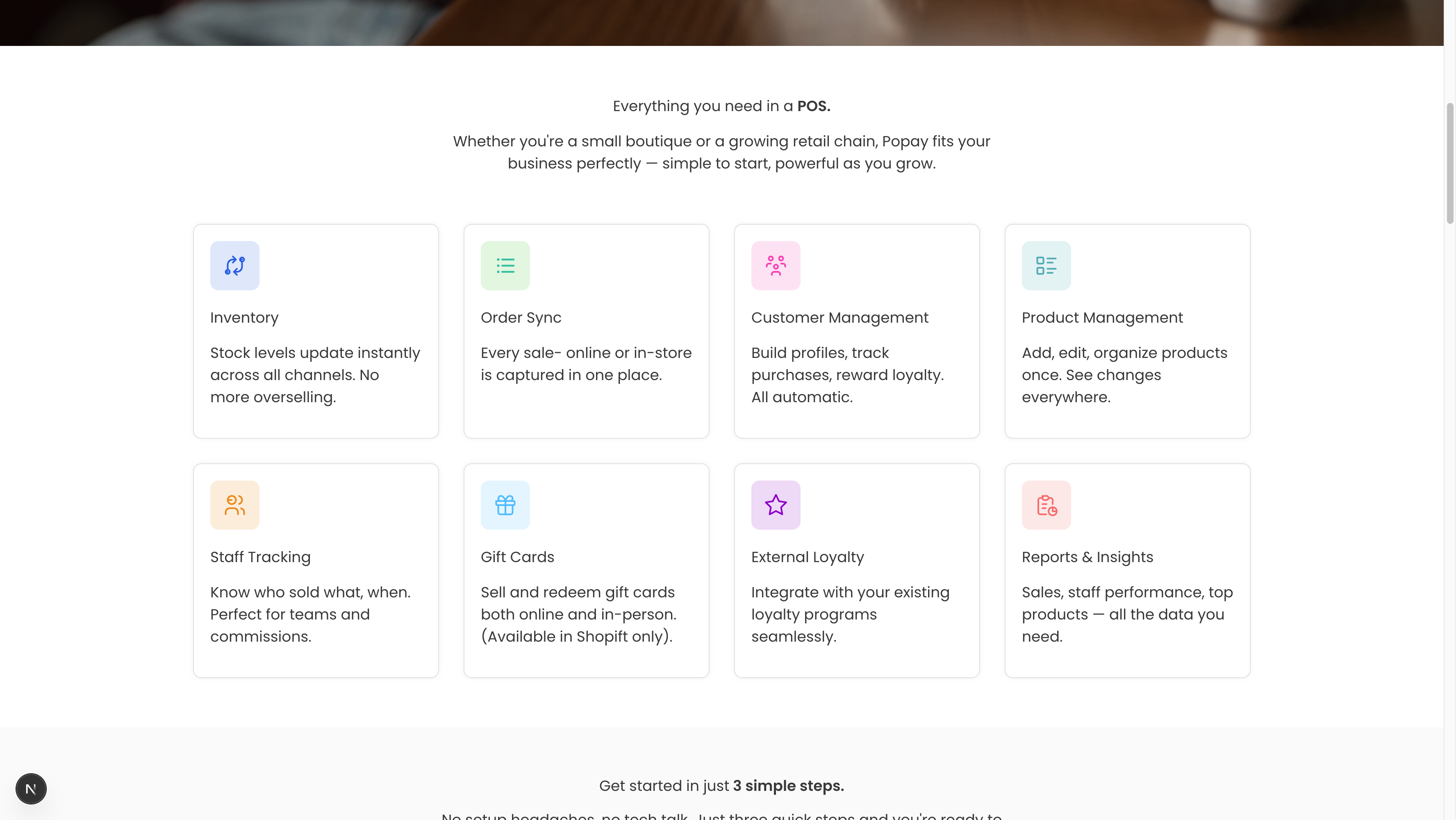
The finished Benefits Section as it appears on your website
Overview
The Benefits Section is perfect for highlighting what sets your product apart. It typically appears early on your landing page, right after the Hero Section, to quickly communicate value to visitors.
Key features:
- Section heading and description with rich text support
- Multiple benefit items (2-12 recommended)
- Icon or image for each benefit
- Title and description for each benefit
- Flexible layout options (grid or list)
- Customizable background colors
- Responsive design
Step 1: Navigate to Your Page
- Open Sanity Studio
- Go to "Pages" in the sidebar
- Select your page (e.g., "Home")
- Scroll to the "Sections" area
Step 2: Add Benefits Section
- Click the "+" button to add a new section
- Select "Benefits Section" from the dropdown
- The section will appear with empty fields
Step 3: Configure Section Heading
- Click into the "Section Heading" field (required)
- Enter your main heading
- Example: "Everything you need in a POS"
- Example: "Why businesses choose us"
- Example: "Features that make a difference"
Best practices:
- Keep it clear and benefit-focused
- 4-7 words is ideal
- Use power words: "Everything", "Complete", "Perfect", "Essential"
Step 4: Add Section Description
- Click into the "Section Description" field
- Write 1-2 sentences that expand on the heading
- Example: "Whether you're a small boutique or a growing retail chain, Popay fits your business perfectly — simple to start, powerful as you grow."
Best practices:
- Explain who this is for or why it matters
- Keep it under 30 words
- Make it specific to your audience
Step 5: Add Your First Benefit
- Click "Add" in the "Benefits" field
- A new benefit item will appear with several fields
Icon
- Click into the "Icon" field
- Enter an emoji or icon identifier
- Examples: "⚡", "🎯", "💰", "🔒", "📊", "🚀"
- Or use icon names if your site supports icon libraries
Image (Alternative)
If you prefer images over icons:
- Click "Image (Alternative to Icon)"
- Upload an image file
- Add alt text for accessibility
Image specs:
- Size: 64x64px or 128x128px
- Format: PNG or SVG
- Style: Simple, recognizable icons work best
Benefit Title
- Click into "Benefit Title" (required)
- Enter a short, punchy title
- Example: "Inventory"
- Example: "Real-time Sync"
- Example: "Easy Setup"
Best practices:
- 1-3 words
- Start with a strong noun or verb
- Be specific, not generic
Description
- Click into "Description" (required)
- Write 1-2 sentences explaining the benefit
- Example: "Stock levels update instantly across all channels. No more overselling."
Best practices:
- Focus on the benefit, not the feature
- Use "you" language when possible
- Keep it under 20 words
- End with the outcome or result
Step 6: Add More Benefits
Repeat Step 5 to add all your benefits. The system allows 2-12 benefits.
Recommended number of benefits:
- 3-4 benefits: Best for focused messaging
- 6 benefits: Standard, works with 2-column or 3-column grid
- 8-9 benefits: Comprehensive, use 3 or 4-column grid
- 12 benefits: Maximum, consider splitting into two sections
Common benefit categories:
- Core features
- Time/money savings
- Security/reliability
- Ease of use
- Integration capabilities
- Support/service
- Scalability
- Analytics/insights
Step 7: Choose Layout Style
- Scroll to "Layout Style"
- Select the best layout for your content:
Grid (2 columns)
- Best for: 4-6 benefits
- Look: Two columns, spacious
- Use when: You have longer descriptions
Grid (3 columns)
- Best for: 6-9 benefits (most common)
- Look: Three columns, balanced
- Use when: Standard benefit showcase
Grid (4 columns)
- Best for: 8-12 benefits
- Look: Four columns, compact
- Use when: Many benefits, shorter descriptions
List (Vertical)
- Best for: 3-5 benefits with detailed descriptions
- Look: Stacked vertically, one per row
- Use when: Benefits need more explanation
Cards
- Best for: 4-8 benefits
- Look: Elevated cards with shadows
- Use when: You want more visual separation
Step 8: Select Background Color
- Scroll to "Background Color"
- Choose from:
- White: Clean, minimal (use if previous section is colored)
- Light Gray: Subtle separation from white sections
- Brand Light: Use your brand color at low opacity
- Dark: White text on dark background (bold choice)
Best practices:
- Alternate colors between sections for visual rhythm
- Use white/gray for most sections
- Save brand colors for key sections
- Test readability with your chosen color
Step 9: Set Text Alignment
- Go to "Text Alignment"
- Choose:
- Left: More traditional, easier to scan
- Center: Modern, symmetrical (recommended)
When to use each:
- Center: When using grid layouts with icons
- Left: When using list layout or lots of text
Step 10: Preview and Adjust
- Click "Publish" to save your changes
- View your website to see the Benefits Section
- Check on different screen sizes
- Adjust as needed:
- Too crowded? Reduce number of benefits or change layout
- Hard to read? Adjust background color or text alignment
- Icons unclear? Try different emojis or upload images
Complete Example
Here's a complete Benefits Section for a POS system:
Section Heading: "Everything you need in a POS."
Section Description: "Whether you're a small boutique or a growing retail chain, Popay fits your business perfectly."

Benefits:
1. Icon: 🔄 | Title: "Inventory" | Description: "Stock levels update instantly across all channels. No more overselling."
2. Icon: 📋 | Title: "Order Sync" | Description: "Every sale - online or in-store is captured in one place."
3. Icon: 👥 | Title: "Customer Management" | Description: "Build profiles, track purchases, reward loyalty. All automatic."
4. Icon: 📦 | Title: "Product Management" | Description: "Add, edit, organize products once. See changes everywhere."
5. Icon: 👔 | Title: "Staff Tracking" | Description: "Know who sold what, when. Perfect for teams and commissions."
6. Icon: 🎁 | Title: "Gift Cards" | Description: "Sell and redeem gift cards both online and in-person."
7. Icon: ⭐ | Title: "External Loyalty" | Description: "Integrate with your existing loyalty programs seamlessly."
8. Icon: 📊 | Title: "Reports & Insights" | Description: "Sales, staff performance, top products — all the data you need."

Layout: Grid (4 columns)
Background: Light Gray
Alignment: Center
Icon Selection Guide
Emoji Icons (Easy Option)
Use standard emojis for quick setup:
- Speed/Performance: ⚡ 🚀 💨
- Security: 🔒 🛡️ 🔐
- Money/Value: 💰 💵 💸 📈
- Communication: 💬 📧 📱 ☎️
- Data/Analytics: 📊 📈 📉 💹
- Success: ✅ ⭐ 🎯 🏆
- Time: ⏱️ ⏰ 📅 🕐
- Tools: 🔧 🛠️ ⚙️ 🔨
- People: 👥 👤 👨💼 👩💼
- Integration: 🔗 🔌 🤝
Custom Icons
For a more professional look:
- Use icon libraries (Font Awesome, Heroicons, etc.)
- Upload custom SVG icons
- Maintain consistent style across all icons
- Keep icons simple and recognizable
Troubleshooting
Issue: Too many benefits, section feels overwhelming
Solution:
- Reduce to 6-8 most important benefits
- Use 4-column grid for compact display
- Consider splitting into two Benefits Sections
- Group related benefits together
Issue: Descriptions are too long
Solution:
- Edit down to 15-20 words max
- Focus on one key benefit per item
- Remove unnecessary words
- Use bullet points if needed (in description field)
Issue: Icons don't match or look inconsistent
Solution:
- Stick to one icon style (all emoji or all custom)
- Use icons from the same icon family
- Maintain similar visual weight
- Test icons at actual display size
Issue: Section looks empty with few benefits
Solution:
- Use 2-column or List layout for spacing
- Add more detailed descriptions
- Use images instead of simple icons
- Consider combining with another section type
Issue: Background color doesn't look good
Solution:
- Try Light Gray instead of White
- Ensure contrast with surrounding sections
- Test with actual icons/images in place
- View on actual device, not just in Studio
Variations and Use Cases
Feature Grid
When: Showcasing product features
Example: SaaS dashboard features, app capabilities
Style: 3-column grid, centered, with simple icons
Value Propositions
When: Explaining why choose you
Example: "Fast", "Secure", "Reliable"
Style: 3-4 benefits, larger icons, brief descriptions
How It Works (Benefits-focused)
When: Process benefits, not just steps
Example: "Easy Setup", "Instant Sync", "Real Results"
Style: 3-column grid with numbered icons
Comprehensive Feature List
When: Detailed product overview
Example: All features of a complex product
Style: 4-column grid or List layout, 8-12 items
Schema Reference
The Benefits Section schema is defined in: sanity/schemas/sections/benefitsSection.ts
Key fields:
heading(required): Portable Textdescription: Portable Textbenefits(required, 2-12 items): Array of objects
- icon (required): String
- image: Image
- title (required): Portable Text
- description (required): Portable Text
layout: String (grid-2, grid-3, grid-4, list, cards)backgroundColor: String (white, gray, brand-light, dark)alignment: String (left, center)
Best Practices Summary
✅ DO:
- Focus on benefits, not just features
- Use consistent icon style
- Keep descriptions concise (under 20 words)
- Use 6-8 benefits for best impact
- Choose layout based on content amount
- Test on mobile devices
- Use clear, specific titles
❌ DON'T:
- List more than 12 benefits (split into sections instead)
- Mix emoji and custom icons
- Write generic benefits ("Great quality", "Best service")
- Use overly complex icons
- Forget to add alt text for images
- Make descriptions too technical
- Use more than 3 words for titles
Related Sections
Combine Benefits Section with:
- Hero Section: Lead with benefits after hero
- Stepper Section: Show benefits in context of process
- Testimonials: Prove benefits with social proof
- Pricing Section: Connect features to pricing tiers
Next Steps: Learn how to create a Stepper Section to show your process.