

How to Create a Hero Section
A Hero Section is the eye-catching header that appears at the top of your landing pages. It features a compelling headline, description, call-to-action buttons, and a background image or video.
What you'll create:
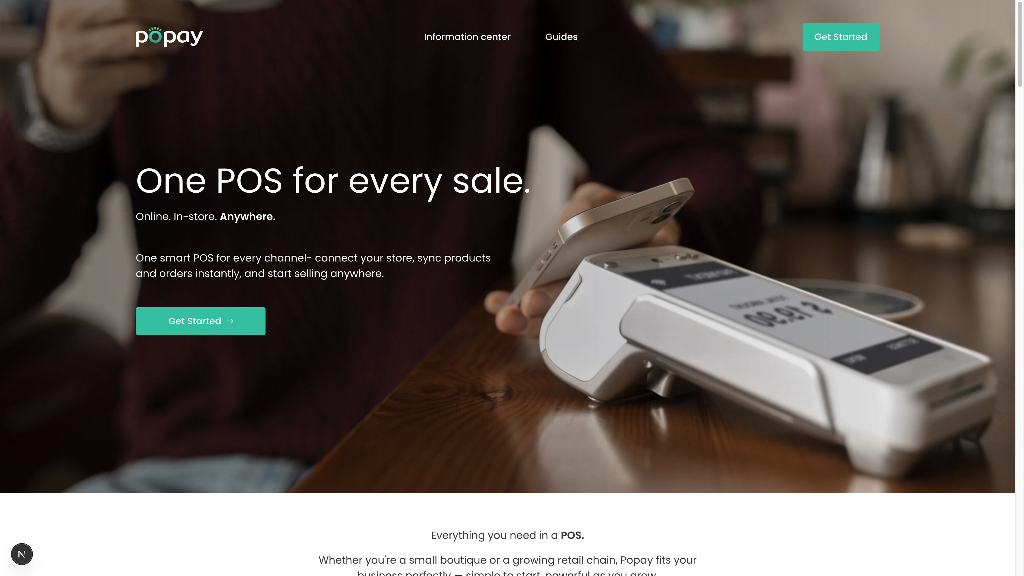
The finished Hero Section as it appears on your website
Overview
The Hero Section is one of the most important sections on your website. It's the first thing visitors see and sets the tone for your entire page. A well-designed hero section can significantly increase user engagement and conversions.
Key features:
- Eye-catching headline with rich text support
- Optional subheading for additional context
- Compelling description text
- Primary and secondary CTA buttons
- Background image or video support
- Customizable text alignment
- Adjustable section height
- Dark overlay for better text readability
Step 1: Navigate to Pages in Sanity Studio
- Open your Sanity Studio (usually at
http://localhost:3333or your production studio URL) - Click on "Pages" in the left sidebar
- Select the page where you want to add a Hero Section (e.g., "Home" or "Landing Page")
- Scroll to the "Sections" field
Step 2: Add a New Hero Section
- Click the "+" button in the Sections field
- Select "Hero Section" from the list of available sections
- The Hero Section will be added with default settings
Step 3: Configure the Heading
The heading is the most prominent text in your hero section.
- Click into the "Heading" field
- Enter your main headline (e.g., "One POS for every sale.")
- You can format the text using the rich text editor:
- Use bold for emphasis
- Apply different heading styles
- Change text color (if needed)
Best practices:
- Keep it short and punchy (5-8 words)
- Focus on the main benefit or value proposition
- Use action-oriented language
- Make it memorable
Step 4: Add Subheading (Optional)
The subheading provides additional context to your headline.
- Click into the "Subheading" field
- Enter supporting text (e.g., "Online. In-store. Anywhere.")
- Format as needed using the rich text editor
Best practices:
- Keep it brief (3-5 words)
- Complement, don't repeat the heading
- Use it to clarify or expand on the headline
Step 5: Write the Description
The description text provides more detail about your offering.
- Click into the "Description" field
- Write 1-2 sentences explaining your product/service
- Example: "One smart POS for every channel - connect your store, sync products and orders instantly, and start selling anywhere."
Best practices:
- 20-30 words is ideal
- Focus on benefits, not features
- Use clear, simple language
- Include your key value proposition
Step 6: Configure Primary CTA Button
Every hero section needs a strong call-to-action.
- Expand the "Primary Button" section
- Fill in:
- Button Text: e.g., "Get Started", "Try it Free", "Book a Demo"
- Button Link: URL or path (e.g., "/signup" or "https://app.example.com")
- Button Style: Choose from:
- Primary (Filled): Most prominent, for main action
- Secondary (Outlined): Less prominent
- Ghost (Text Only): Minimal style
Best practices:
- Use action verbs ("Get", "Start", "Try", "Book")
- Keep it short (2-3 words)
- Make it clear what happens when clicked
- Use "Primary" style for your main CTA
Step 7: Add Secondary CTA Button (Optional)
Add a second button for alternative actions.
- Expand the "Secondary Button (Optional)" section
- Fill in:
- Button Text: e.g., "Learn More", "Watch Demo", "Contact Sales"
- Button Link: URL or path
- Button Style: Usually "Secondary" or "Ghost"
Best practices:
- Use for lower-commitment actions
- Common examples: "Learn More", "See Pricing", "Watch Video"
- Style differently from primary button (usually outlined or ghost)
Step 8: Upload Background Image
A compelling background image makes your hero section stand out.
- Click "Background Image"
- Click "Upload" or drag and drop an image
- After upload, click "Edit Hotspot" to adjust the focal point
- Add Alternative text for SEO and accessibility
Image requirements:
- Dimensions: 1920x1080px or larger (16:9 aspect ratio)
- File size: Under 500KB (optimize before upload)
- Format: JPG or PNG
- Content: High-quality, relevant to your message
Best practices:
- Use images that evoke emotion
- Ensure good contrast with text
- Avoid busy or distracting backgrounds
- Test on mobile devices
Step 9: Add Background Video (Optional)
Videos create an even more engaging experience.
- Expand "Background Video (Optional)"
- Enter the Video URL (must be a direct link to .mp4 file)
- Configure video settings:
- Autoplay: ON (videos should autoplay)
- Muted: ON (required for autoplay to work)
- Loop: ON (video repeats continuously)
Video requirements:
- Format: MP4 (H.264 codec)
- Duration: 10-30 seconds
- File size: Under 5MB (heavily compress)
- Dimensions: 1920x1080px
Best practices:
- Keep videos short and looping
- Ensure smooth loop transition
- Always provide fallback image
- Test performance on slower connections
Step 10: Configure Layout & Styling
Customize how your hero section looks.
Text Alignment
- Select "Text Alignment"
- Choose:
- Left: Professional, easy to read
- Center: Balanced, modern (most common)
- Right: Unusual, use sparingly
Section Height
- Select "Section Height"
- Choose:
- Small (400px): Compact, for internal pages
- Medium (600px): Standard size
- Large (800px): Prominent, recommended for home page
- Full Screen: Takes entire viewport
Background Overlay
- Expand "Background Overlay" settings
- Configure:
- Enable Overlay: Toggle ON for better text readability
- Overlay Opacity: 0.3-0.5 recommended (0 = transparent, 1 = opaque)
- Overlay Color:
- Black: Most common, works with light text
- White: Use with dark text
- Brand Color: Use your primary brand color
Best practices:
- Use overlay when text is hard to read
- Start with 0.4 opacity and adjust
- Dark overlay + white text is most readable
- Test on different screen sizes
Step 11: Preview and Publish
- Click "Publish" in the top right corner
- Open your website to see the Hero Section live
- Test on different devices:
- Desktop (1920px width)
- Tablet (768px width)
- Mobile (375px width)
Examples of Great Hero Sections
Example 1: E-commerce Hero
Heading: "One POS for every sale."
Subheading: "Online. In-store. Anywhere."
Description: "Connect your store, sync instantly, sell everywhere."
Primary CTA: "Get Started" → /signup
Secondary CTA: "Watch Demo" → /demo
Background: Store checkout image with 0.4 black overlay
Alignment: Center
Height: Large (800px)
Example 2: SaaS Product Hero
Heading: "Manage your business in one place"
Description: "All your tools, data, and team in a single powerful platform."
Primary CTA: "Start Free Trial" → /trial
Secondary CTA: "See How It Works" → /features
Background: Dashboard screenshot with gradient overlay
Alignment: Left
Height: Medium (600px)
Example 3: Service-Based Hero
Heading: "Professional web design that converts"
Subheading: "From concept to launch"
Description: "We create stunning websites that turn visitors into customers."
Primary CTA: "Get a Quote" → /contact
Secondary CTA: "View Portfolio" → /portfolio
Background: Video of design process (looping)
Alignment: Center
Height: Fullscreen
Troubleshooting
Issue: Text is hard to read on background image
Solution:
- Increase overlay opacity (try 0.5-0.6)
- Use darker overlay color
- Choose a less busy background image
- Adjust image hotspot to avoid busy areas
Issue: Video doesn't autoplay
Solution:
- Ensure "Muted" is set to ON (browsers block unmuted autoplay)
- Check video URL is direct link to .mp4 file
- Verify video file size is under 5MB
- Test in different browsers
Issue: Hero section looks different on mobile
Solution:
- Test background image focal point on mobile
- Consider shorter heading for mobile screens
- Reduce section height on mobile (handled automatically)
- Check that buttons don't overflow
Issue: Buttons not visible
Solution:
- Ensure button text is filled in
- Check that link is provided
- Verify button style is set
- Increase overlay opacity for better contrast
Issue: Section appears too tall/short
Solution:
- Adjust "Section Height" setting
- Try different height options
- Use "Large" for home page, "Medium" for other pages
- Test on actual devices, not just browser resize
Schema Reference
The Hero Section schema is defined in: sanity/schemas/sections/heroSection.ts
Key fields:
heading(required): Portable Textsubheading: Portable Textdescription: Portable TextprimaryCTA: Object with text, link, stylesecondaryCTA: Object with text, link, stylebackgroundImage: Image with alt textbackgroundVideo: Object with videoUrl, autoplay, muted, loopalignment: String (left, center, right)height: String (small, medium, large, fullscreen)overlay: Object with enabled, opacity, color
Best Practices Summary
✅ DO:
- Write compelling, benefit-focused headlines
- Use high-quality, optimized images
- Always include a clear primary CTA
- Test on multiple devices
- Use overlay for better text readability
- Keep text concise and scannable
- Ensure good color contrast
❌ DON'T:
- Use overly long headlines (over 10 words)
- Upload huge unoptimized images
- Forget alternative text for images
- Use videos over 5MB
- Ignore mobile responsiveness
- Make text hard to read
- Use too many CTA buttons (max 2)
Related Sections
After creating your Hero Section, consider adding:
- Benefits Section: Highlight key features
- Stepper Section: Show how your product works
- Video Section: Detailed product demonstration
- Testimonials Section: Build trust with reviews
Need help? Check the Documentation Creation Workflow for more guidance.