

How to Create a Services/News Section
A Services Section (also used for News/Articles) displays offerings in an attractive card-based grid layout with images, titles, and descriptions.
What you'll create:
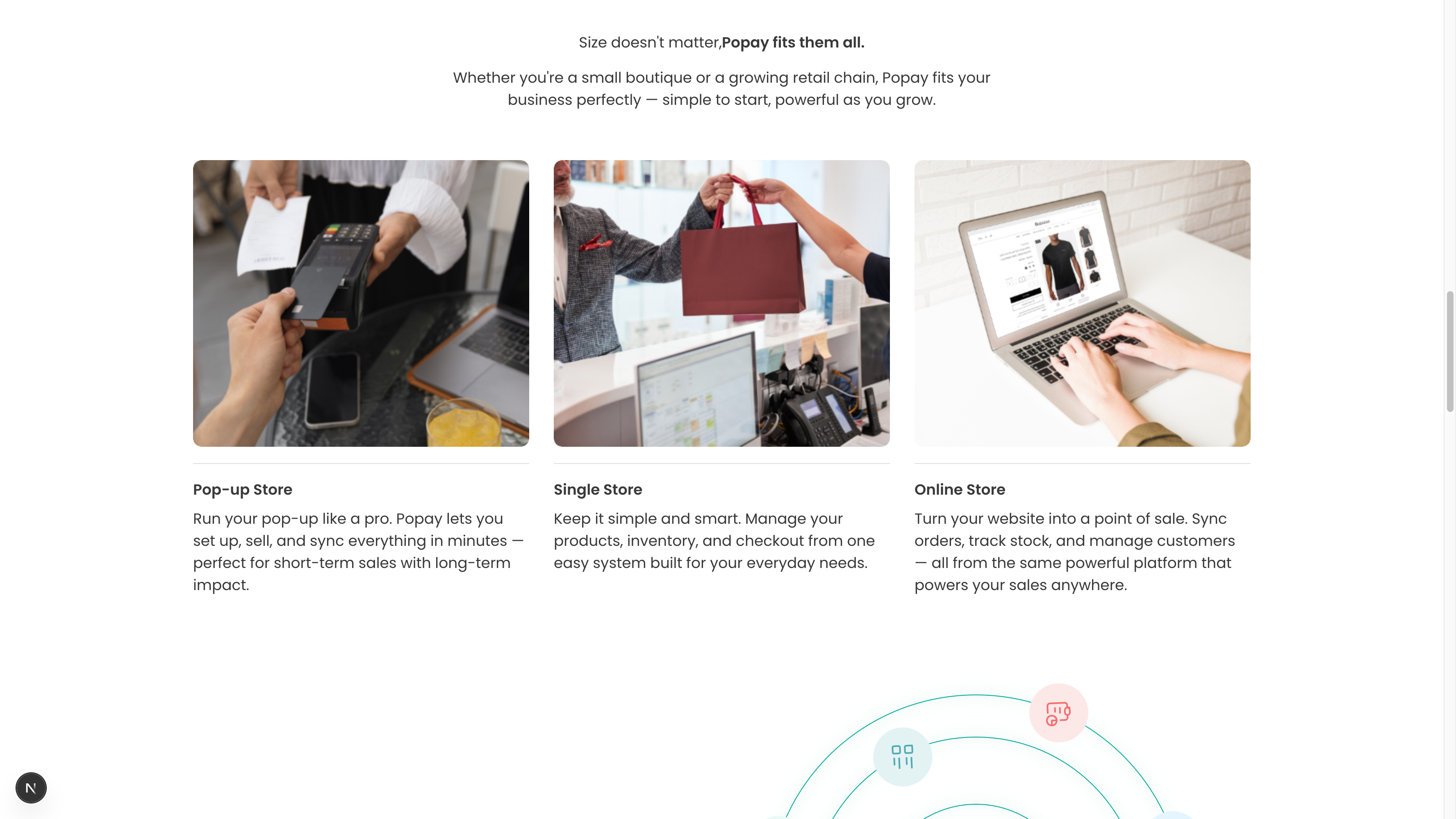
The finished Services Section showing your offerings
Overview
This versatile section works for multiple purposes: services, news articles, blog posts, case studies, or store types. Items are displayed in a responsive grid with images, titles, descriptions, and optional links.
Key features:
- Card-based grid layout
- Featured images for each item
- Heading and description text
- Links to detail pages
- Responsive (adjusts to screen size)
- Pull from Sanity service/news documents
Quick Setup
- Add Section: Pages → Your Page → Sections → Add "Services Section" or "News Section"
- Add Heading: "Our Services" or "Latest News"
- Add Description: Brief section intro
- Select Items: Choose from existing service/news documents
- Publish
Step 1: Create Service/News Documents
Before adding the section, create individual documents:
For Services:
- Go to Content → Services in Sanity Studio
- Click Create New Service
- Fill in:
- Title: Service name
- Description: What the service offers
- Icon: Upload icon/image (recommended: 256x256px)
- Order: Display order
For News/Articles:
- Go to Content → News
- Click Create New
- Fill in:
- Title: Article/news title
- Description: Brief summary
- Image: Featured image (recommended: 800x600px)
- Link (optional): URL to full article
- Order: Display sequence
Step 2: Configure Section
Heading
Enter your main heading:
- Services: "Our Services", "What We Offer", "How We Help"
- News: "Latest News", "Recent Updates", "From Our Blog"
- Store Types: "Find Your Perfect Fit", "We Support All Business Types"
Description
1-2 sentences of context:
- "Comprehensive solutions for your business needs."
- "Stay updated with our latest announcements."
- "Whether you're a small boutique or growing chain, we've got you."
Step 3: Select Items to Display
- Click "Add" in the Services/News field
- Select existing documents
- Choose 3-6 items for best visual balance
- Order matters: They display as selected
Selection tips:
- Mix different types/categories
- Feature most popular/important first
- Keep consistent image sizes
- Ensure all have descriptions
Layout Guidelines
Grid Display
- 3 columns on desktop: Best for 3, 6, or 9 items
- 2 columns on tablet: Automatic
- 1 column on mobile: Automatic
Card Content
Each card typically shows:
- Featured image (top)
- Icon (if service)
- Title (headline size)
- Short description (2-3 lines)
- Optional CTA/link
Content Best Practices
Titles
✅ DO:
- Keep to 3-5 words
- Use clear, descriptive names
- Be consistent in style
- Front-load important words
❌ DON'T:
- Use overly long titles
- Be vague or generic
- Mix title formats
- Use all caps
Descriptions
✅ DO:
- Write 15-25 words
- Focus on benefits
- Use active voice
- End with value proposition
❌ DON'T:
- Write paragraphs
- Use jargon
- Be too salesy
- Forget the audience
Images
✅ DO:
- Use consistent dimensions
- Optimize file size (under 200KB)
- Choose relevant visuals
- Ensure good quality
❌ DON'T:
- Mix aspect ratios
- Use generic stock photos
- Upload huge files
- Forget alt text
Example Configurations
Service Showcase
Heading: "Comprehensive Solutions for Every Need"
Description: "From setup to support, we've got you covered."

Services (3 selected):
1. Title: "POS Integration"
   Description: "Connect with Shopify, WooCommerce, and more."
   Icon: integration-icon.svg
   Order: 1

2. Title: "Inventory Management"
   Description: "Real-time tracking across all channels."
   Icon: inventory-icon.svg
   Order: 2

3. Title: "Analytics & Reports"
   Description: "Insights that drive better decisions."
   Icon: analytics-icon.svg
   Order: 3
News/Blog Section
Heading: "Latest from Our Blog"
Description: "Tips, updates, and industry insights."

News (3 selected):
1. Title: "10 Ways to Boost Holiday Sales"
   Description: "Proven strategies for your best season yet."
   Image: holiday-sales.jpg
   Link: /blog/holiday-sales-tips
   Order: 1

2. Title: "New Features: Multi-Store Support"
   Description: "Manage all locations from one dashboard."
   Image: multi-store.jpg
   Link: /blog/multi-store-update
   Order: 2

3. Title: "Customer Spotlight: Urban Boutique"
   Description: "How they grew 200% in 6 months."
   Image: case-study.jpg
   Link: /blog/urban-boutique-story
   Order: 3
Store Types
Heading: "Perfect for Every Business"
Description: "From pop-ups to multi-location chains."

Store Types (3 selected):
1. Title: "Pop-up Store"
   Description: "Quick setup for short-term sales events."
   Image: popup-store.jpg

2. Title: "Single Location"
   Description: "Everything you need in one place."
   Image: single-store.jpg

3. Title: "Multi-Location Chain"
   Description: "Centralized control, local flexibility."
   Image: multi-location.jpg
Image Specifications
For Services (Icons)
- Size: 256x256px or 512x512px
- Format: SVG (best) or PNG
- Style: Simple, flat design
- Color: Match brand colors
- Background: Transparent
For News/Articles
- Size: 1200x800px (3:2 ratio) or 800x600px (4:3)
- Format: JPG (photos) or PNG (graphics)
- File Size: Under 200KB (optimize!)
- Quality: High-res but compressed
- Subject: Relevant to article content
Advanced Customization
Adding Links
Make cards clickable:
- Link to detail pages
- External articles
- Product pages
- Contact forms
Filtering/Categories
If your schema supports it:
- Filter by service type
- Show news by category
- Tag-based filtering
- Date-based sorting
Load More
For many items:
- Show 3-6 initially
- "Load More" button
- Pagination
- Infinite scroll
Troubleshooting
Images different sizes
Solution:
- Crop all images to same aspect ratio
- Use object-fit: cover in CSS
- Set consistent dimensions in schema
- Use image optimization tool
Cards look crowded
Solution:
- Reduce to 3 columns instead of 4
- Shorten descriptions (under 20 words)
- Increase grid gap spacing
- Use cards layout instead of grid
Text overlaps on mobile
Solution:
- Test on actual mobile devices
- Reduce font sizes for mobile
- Ensure responsive CSS
- Check padding/margins
No items showing
Solution:
- Verify documents are published
- Check isActive/isPublished fields
- Ensure items are selected in section
- Review order field
Schema Reference
File: sanity/schemas/sections/servicesSection.ts or newsSection.ts
Section fields:
heading(required): Portable Textdescription: Portable Textservicesornews(required): Array of referenceslayout: String (grid-2, grid-3, grid-4)backgroundColor: String
Service/News document fields:
title(required): Stringdescription(required): Texticonorimage: Imagelink: URLorder: NumberisActive: Boolean
Design Tips
Visual Consistency
- Use same image aspect ratio
- Consistent icon style
- Uniform card heights
- Matching color scheme
Hierarchy
- Title most prominent
- Description secondary
- CTA/link clearly visible
- Image grabs attention
White Space
- Don't overcrowd
- Padding around text
- Gap between cards
- Breathing room
Related Sections
Works well with:
- Hero Section: Lead with services overview
- Testimonials: Prove service value
- CTA Block: Convert browsers to customers
- FAQ Section: Answer service questions
Pro Tip: Update your news section regularly (weekly or monthly) to show your site is active and maintained. Even small updates build trust!